Classification Models & Visual Insights
Model Training & Visualizations
We trained and evaluated two different models using TF-IDF vectorized news article data:
- Logistic Regression
- Multinomial Naive Bayes
Each model was evaluated on performance metrics and supported with insightful visualizations.
🔹 1. Logistic Regression
A linear classifier suitable for sparse high-dimensional data like TF-IDF.
Metrics Calculated:
- Accuracy
- Precision
- Recall
- F1 Score
📊 Visualizations:
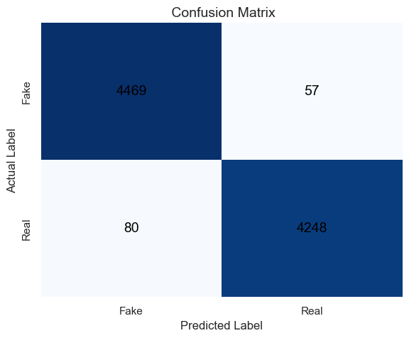
- Confusion Matrix — Displays correct and incorrect predictions.
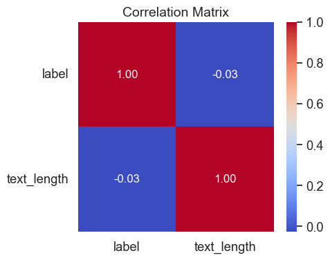
- Correlation Matrix — Shows correlation between article text length and label.
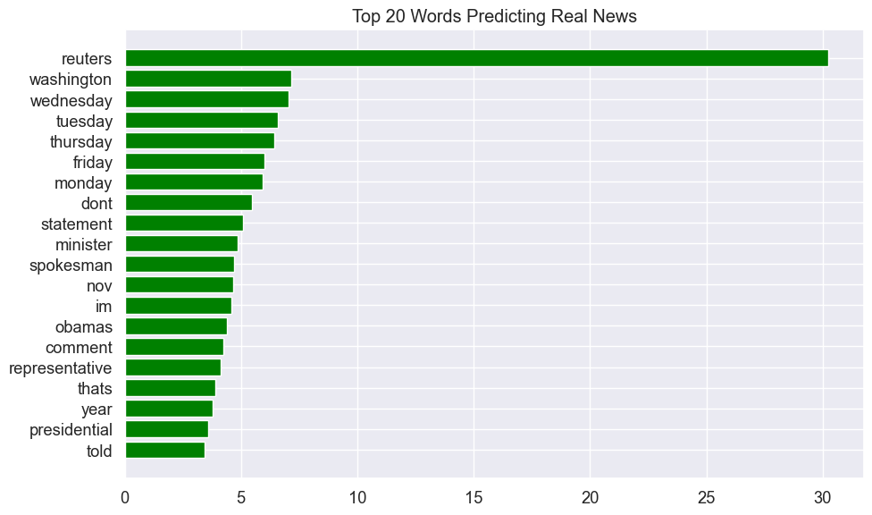
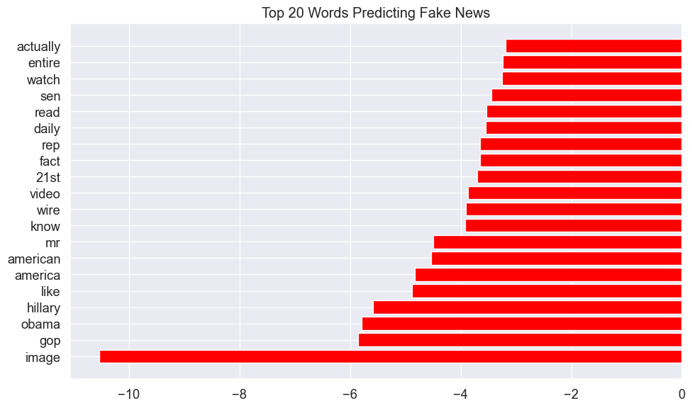
- Top Keywords — Bar plots of the most predictive words for fake and real news.
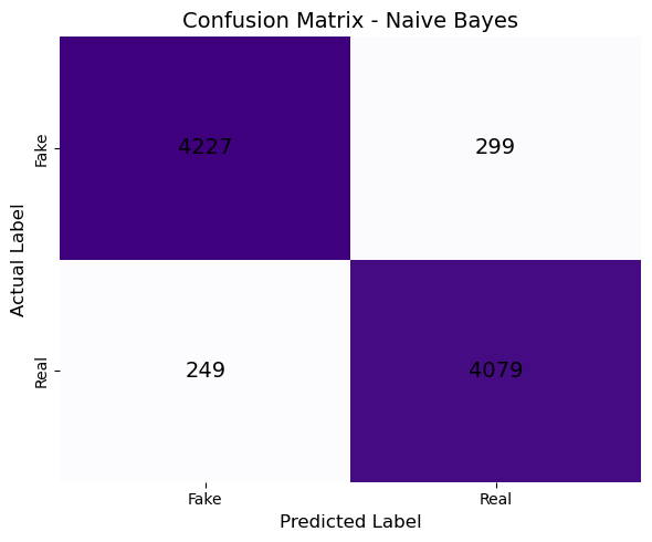
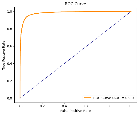
2. Multinomial Naive Bayes
A fast, probabilistic classifier designed for text data with discrete features.
Metrics Calculated:
- Accuracy
- Precision
- Recall
- F1 Score
📊 Visualizations:
- Confusion Matrix — Indicates classification performance.
- ROC Curve — Visualizes the trade-off between true positive and false positive rates.
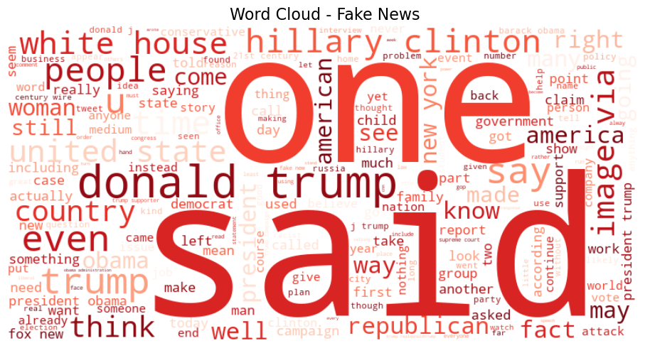
- Word Clouds:
- 🔴 Fake News — Shows frequent terms in fake news articles
Fake News - 🟢 Real News — Highlights words common in real news articles
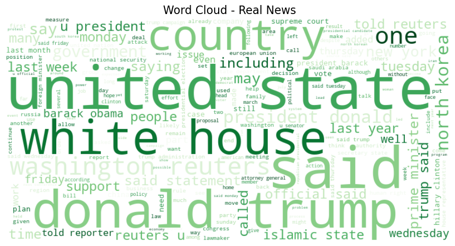
Real News
These visualizations help interpret not just how well the models performed, but also why — based on word patterns and prediction behavior.